 Compared to the first draft, I added more description under each article title so that it can give my audience an idea of what they are about to read. I did not rearrange any of the text, but simply just added more elements to enhance the overall design of the TOC.
0 Comments
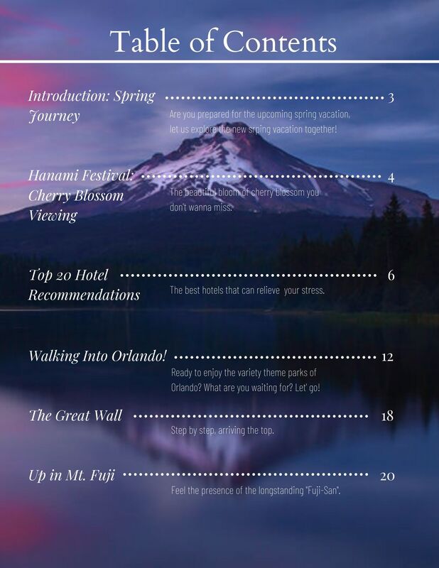
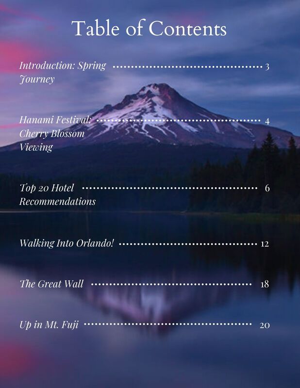 For the table of contents, I choose to use similar fonts as the ones I've used for the magazine cover in order to maintain the feeling of a whole. The image for the TOC is already a mixture of cold and dark colors so I decided that the color of the text will need to be bright for it to show contrast to the image. After considering and testing out many colors, I ended up using white for all the text because it's not to fancy and it's bright enough. More importantly, the idea that I want to keep the format and layout clean still remains unchanged, therefore, by using one single color can keep the TOC neat and pretty.
Based on the image I choose for the magazine cover, I wanted the image of my table of contents to be in similar manner. This image continues the cold color series of the cover image, and it also has mountain and reflection. I did however were concern about the fact that the two images could've been too similar to each other, and wondered if I should use it for the TOC, but regardless, I choose to use it in the end. 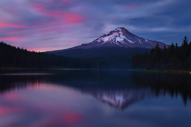 Image Citation: “Wy’east | Trillium Lake - Mount Hood - Oregon.” Nate Zeman - Photography, www.natezeman.com/photo/wyeast/. Accessed 16 Apr. 2021.
 Compared to the original version, I added more text to fill in the empty spaces. I also arranged the placement of text so that it's more consistent on the cover.
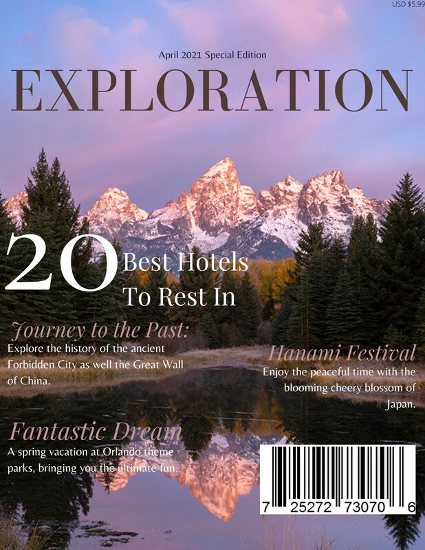
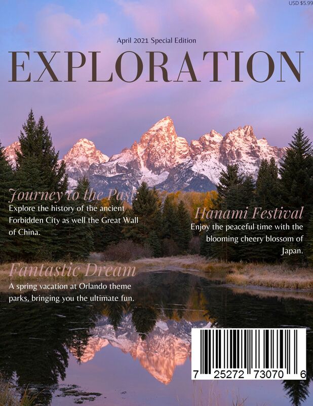 Title/masthead: The title of my magazine is called "EXPLORATION". This contains the idea that every trip is the starting of a new journey or exploration, and that everyone can become an explorer.
Typography: The color of the text are very consistent with the image throughout as I want everything to have a right balance. The font choices are as well on the clean and neat side, I was aiming for an elegant feel when considering the type of font I would use. I also italicized the cover line so that not all texts all straight and formal, softening the possible stiffness. Image: The focus would be the middle part of this image, the actual mountain and the reflection of it on the water creates the perfect balance I longed for. The empty spaces on the top and the bottom are also the right amount, it won't be too difficult to fill in those spaces with text. More importantly, the overall tone of this image delivers the vibe that I would like to have on my travel magazine, which is why I decided to use this image for the cover of my final magazine. Language: My choice of language is not too formal. I wanted my audience to feel curious about the contents they're about to read, so I choose to speak in a quite colloquial manner. I hope my readers can feel relax and at ease while reading my magazine, as if we're just friends that are discussing where to have an enjoying vacation. After looking online, I found this image which I thought it would be suitable for my final magazine cover. The focus would be the middle part of this image, the actual mountain and the reflection of it on the water creates the perfect balance I longed for. The empty spaces on the top and the bottom are also the right amount, it won't be too difficult to fill in those spaces with text. More importantly, the overall tone of this delivers the vibe that I would like to have on my travel magazine, which is why I decided to use this image for the cover of my final magazine. 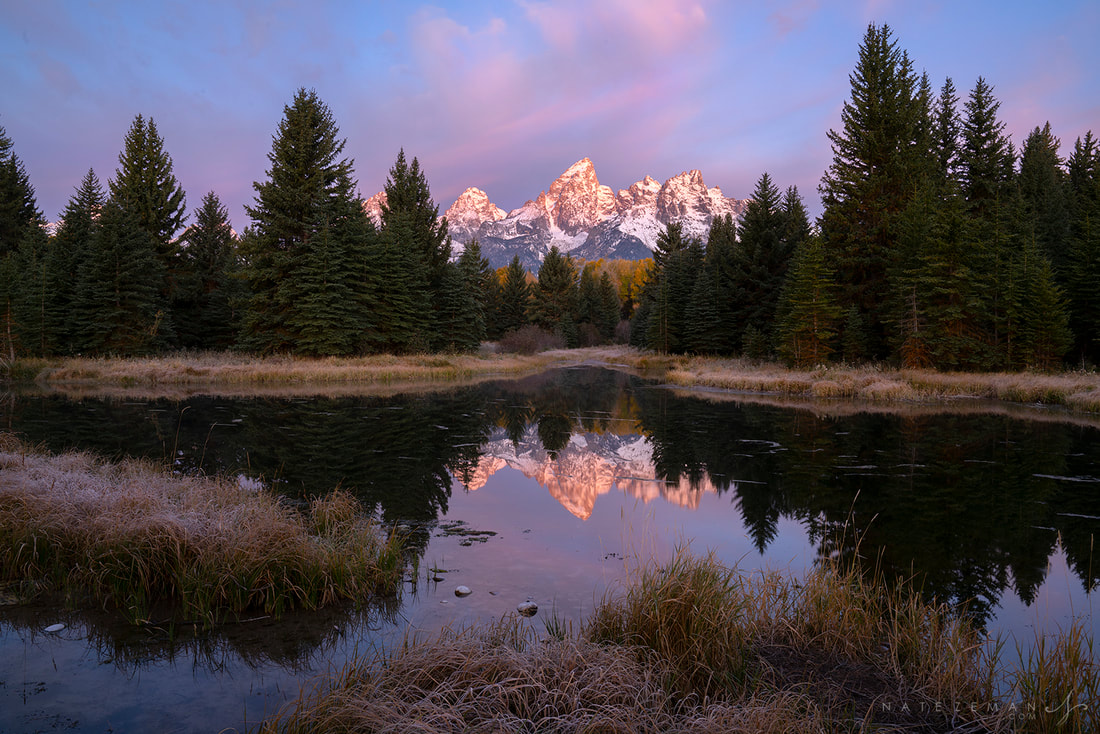 Image Citation: “Schwabacher Sunrise | Schwabacher Landing - Grand Teton National Park - Wyoming.” Nate Zeman - Photography, www.natezeman.com/photo/schwabacher-sunrise/. Accessed 16 Apr. 2021.
I was going to choose an image for my magazine cover from the pictures I took during vacations. But then I realized that they lacked the vibe that I was looking for, and some parts of the image seems too empty, so I decided to choose image from online instead. Pictures I took:
For the final project, I was going to continue with the concept of doing an anime magazine, but now I decided that I will do a vacation or travel magazine instead.
Video link: https://www.youtube.com/watch?v=CSpyZor-Byk Just as the title of the video suggest, this video discuss how social media shapes our identity. It talks about the idea of discourses, how discourses within technology can lead us to the different identities and possibilities. Having create various identities in the virtual allows us to explore and act differently than our normal self, because it's a play on the discourses. Generally speaking, discourses plays a huge role within our identity which then affects how we response or use the right provided to us by social media when we got exposed to them.
I personally am not a big fan of social media, so it really does not influence me that much. If I have to provide examples then it would probably be the information I obtained through social media regarding the pandemic; simply knowing about the situations of some of my friends just makes me value my life even more. Another example could be how I join a community of a game that I played and made some friends while I'm in it. However, I would not say that I act differently just because I'm in the virtual world though. Article link: https://www.bbc.com/future/article/20200512-how-the-news-changes-the-way-we-think-and-behave This article was about how news can impact ourselves physically and mentally. It discussed the negativity brought on by news as well as the 'techniques' within, such as framing effects. It provided various examples and studies to proof how media around us, not just news, can have long lasting effects on our body. All of the evidence shown does supports the fact that news can change the way we think and behave.
I do agree with this idea. As mentioned in the article, people spend about eleven hours everyday just looking at screens, this amount of exposure is well enough to cause an impact on our body in the long run. This idea is further enforced when knowing that people are visual animals, the images we see are deeper embed into our brain then we think they are. Therefore, I do agree that news can change the way we think and behave. |
AuthorWrite something about yourself. No need to be fancy, just an overview. Archives
April 2021
Categories |
 RSS Feed
